Tuesday, 23 October 2012
Friday, 19 October 2012
Evaluation - Stairs scene for preliminary task (Psycho)
Preliminary task (Psycho) Evaluation – Stairs scene
During our filming of Psycho, I learnt that storyboards are one of the most important and crucial factors of success within filming. Simply because if the storyboard is not detailed enough or drawn clear enough with lots of detail representing the part of the film we are recreating then it is very difficult to carry out. In addition to this it wastes time as we spend time attempting to figure out what is happening in a particular shot, when we could have been filming that shot. Therefore the detail and importance of the storyboard is huge as it is basis of the film and without it, it causes great difficultly when filming.
While filming the stairs scene, there were a few health and safety risks. There was the risk of injury along with damaging school property if the acting and filming wasn’t carried out properly. As we started filming the stairs scene the shape of the tripod became a hazard. I could have easily tripped over the legs on the tripod because it is in a triangular shape so the camera can balance properly once being placed on the top. Along with the tripod, other students (who were not involved in the filming) were walking past. This could have interfered with our filming but more importantly those students walking past could have easily tripped over any of our filming equipment. In addition to the tripod hazard another health and safety risk had risen. As Michael was acting out the stairs scene in psycho there was a massive risk of him falling down the stairs backwards causing himself serious or minimal injury as he could not see what was behind him as he was acting all the backwards fall on the 6th form block stairs. Lucky for us though, no one was injured during the filming plus no equipment was damaged either.
Michael was the main actor for the preliminary task and his acting skills as Abhorghast was great. He acted exactly the same in every shot and continued to do act in the same manner on every day that we shot the prelimary task. In addition to this the directing talent was fantastic as well because myself and Leeanne gave Michael strict instructions on how to act for each shot and if it was completed to the standard we was hoping for then we would redo the shot until we got it exactly right. For the stabbing scene of Abhorghast on the floor we asked Cody in year 12 to be Mrs Baits, unfortunately she wasn’t as aggressive as we was hoping for so I had to take over whilst Miss Lane completed the filming for that sector of the preliminary task. My aggressive stabbing helped us get the shot we needed in order to complete the filming successfully.
The location scouting was slightly difficult as we was portraying a scene from a house at a school. Therefore because of this we had to find areas of the school that looked more like a corridor in a house as opposed to looking like a school corridor. So after was had already shot a few scenes in the English block staircase we decided to move to the 6th form block to re-shoot the previous scenes and all the news ones as the 6th form block has carpeted hallways and looks more like a home with paintings on the walls and pain on the walls instead of using the cold corridor in the main school building. I felt the management of the filming was not shared out as equally as it could have been due to the fact that Michael was our actor, so he didn’t really have much say in the management instead he was mainly being directed and told what to do. In addition to this I think the sharing of the camera work was not equal either because Leanne was in charge majority of the time or this could have affected camera shots because her ideas were mainly used. However when Leanne missed a few lessons, I was able to put my ideas across with the help of Michael resulting in some excellent camera shots and completing the filming.
We aimed to complete the preliminary task across three media lessons but we did not meet this aim as we changed locations and kept being interrupted by students getting to and from lessons. In addition to this we had a lot of people speaking, walking and other noises in the background which caused us to have to re-shoot shots multiple times. For example I had to re-shoot Michael walking into the school building roughly about 5 or 6 times due to other people talking or walking or either their reflections appearing in shot. This in itself caused our timing to go off course, making us filming for longer than we should have.
The props, costume and continuity was fantastic because Michael made a conscious effort to bring in the exact same costuming (shirt, jumper, tie, trousers, shoes) every media lesson. Lucky for us his hair didn’t rapidly grow in the space of a few days so we didn’t have much to worry about when it came to him looking the same on each day. We kept all the props in one place along with the camera and tripod to ensure that we didn’t lose or misplace everything which overall made filming for us a lot easier as well as giving us one less thing to worry about because we was certain on where everything was and we was also lucky no one else misplaced or removed it.
We only incorporated one stunt when filming and that was when Michael fell down the stairs. There was a massive health and safety risk with this and we did everything that we could to ensure Michael didn’t injury himself. We made Michael fall down the stair slowly and decided that when editing the filming together we was speed up the shot. This ensured that the stunt was completed properly and too a good standard in addition to making sure Michael was safe at all times.
I didn’t really use the zooming technique when filming but in did use it during a few scenes. As Michael walked up the stairs I zoomed out but whilst doing this I realise that I didn’t leave Michael enough head room as he was too tall when he gradually came higher up the stairs. So I set the camera on the tripod and wound it up as high as possible then gradually zoomed out as he was coming up and eventually this idea worked and we was able to get the shot we wanted.
We used various shot sizes and angles throughout the whole of the filming. Establishing and long panning shots were used as Michael entered the building. Medium long and mid-shots were used when Michael entered the building. High and low angle shots were used when looking at the stairs along with point of view shots. Close ups, panning shots and static shots were used throughout the filming in order for us to try and create a duplicate of the stairs scene from Psycho. Due to the detail of Leanne’s storyboard we were able to complete all shots and when she was absent we looked at my vague storyboard along with Miss Lanes substandard storyboard.
In the beginning I found to difficult to attach the camera to the tripod but once I was shown how to do it properly I found it very easy to attach and use. The tripod was also easy to put up and down the only struggle at times was making it evenly balanced in order to the camera to be straight and focused. Other than those few difficulties I found the use of the equipment very simple and easily usable.
Monday, 1 October 2012
Evaluation on comparisons and contrast from Dracula 1931 to Twilight
Dracular 1931
Twilight
The narrative in Twilight in structure different to the narrative in Dracula as it is much more subtle and welcoming. The vampires in Twilight are kind and not deemed evil or monsterous in any way. Theroughtout the film the vampires are not seen as vampires but instead viewed as a "strange" family. This shows a different narrative structure to Dracula as it once again subverts the way vampires are viewed to audiences.
Twilight
- The way the narrative is structured by comparison to "Dracula" (1931)
2. The elements of vampire lore (is it conventional?)
Twilight is a movie which does not meet the conventions of vampirism. Audiences view vampires as dark, creepy, dangerous beings as well as being members of the living dead. Strangely Twilight does not conform to these conventions at all and portray vampires in a less frightening way along with subverting the original conventions that audiences expect to see form vampires. in Twilight instead of the vampires having fangs and being costumed in dark black caped clothing, they are dressed as ordinary teens who look normal in every possible way. The only thing that conforms to vampirism in Twilight is that each vampire is pale in the face and very strong but apart from that, every convention is subverted. The vampires in Twilight sparkle and glisen in sunlight, they never go to rest, the do not sleep in darken or coffins plus they dont bite or eat people in order to survive.
Tuesday, 18 September 2012
Write an evaluation of the imagery you would use in a 30 minute horror film.
If I was to create a 30minute horror film I would use a lot of vulgar imagery to create the full effect of horror and ensure that my audience was scared. The imagery in my horror film would be specifically for Sadists. I would want them to identify with the killer in every possible way, ensuring that there was a lot of explicit imagery throughout the film. I was base my horror film imagery as if I was making my film in the 1960s – 1990s as I am aware that during this time period imagery in horror films were explicit and the horror film watches actually saw the killing along with all the violence and blood. My film would be for a desensitised audience and I would ensure that everything they saw looked believable and realistic. I would ensure that the film was as less predictable as possible as well as wanting my audience to be as scared as much as possible, as I feel this would engage them more as they are watching. I would ensure all my costuming, mise-en-scene and camera work was used to the best of its ability, creating frightening camera shots, such as extreme close ups, high and low angle shots and point of view shots. The mise-en-scene would be bloodcurdling to make sure my audience were unaware of what could happen and where it may happen. Along with this my costuming and make-up would be petrifying. The use or blood and gore would excel in this department to make a disfigured and disgusting image or person to look at during the film. I feel by doing these things I would create an element of fear within my horror film along with keeping my sadist audience engaged throughout the film.
How has the role of women changed in Media over the years
In Dracular 1931 the role of women was viewed as the madona. An innocent, helpless, fragile women being prayed upon by a monterous vampire man. In the film, the woman was dressed in white, in which represents innocence and she was also well groomed. This shows that women were seen to be be protected by men and also made them look helpless due to their image and speech. The actress in Dracula is alone, sleeping as Dracula enters her roomand this automatically puts her in a weaker position as no one is around to save her, therefore if anything bad happened she would have suffer alone and unprotected.
However, in 28days later(2002) the role of women has been largly subverted. Selena is not viewed as the madona or as a whore, instead she is viewed as a fighter full of action. She takes control, fights and is extremely dominant. She also doesnt hesitate to tell her male companions what is on her mind or give them orders and direction when necessary. Along with this she is not sexualised, hence therefore subverting the role of women as well as their representations in horror films. Selena is the strongest character in 28 days later which in itself shows women in a positive light as she is one of the main characters plus she is the strongest and knows exactly what to do and when to do it. the film itself portrays women in a positive way and shows there equality to men.
Normally in horror films women are seen as less equal and more vunerable to men but there are some hooror films which do not conform to the stereotypes of women and men at all but they do show there equality. An example of a horror film that does this is every SAW. In SAW all men and women are tortured equally. They all suffer the same pain and suffering throughout the film, each completing a different task of torture. In addition to this both men and women are sweaty and messy, some women are sexulised in the films but the majority are not.
Wednesday, 12 September 2012
Monday, 30 April 2012
Main Inspiration
Both of these videos inspired my genre of magazine. As both of these artists (Trey Songz and Chris brown) are famous male artists, who attract a lot of female attention plus they sing R’n’B music. I wanted my main model to be portrayed as an artist like Trey Songz or Chris Brown and I wanted to act as if he sang songs just like them. So I based my magazine styling and image of my model around both of these artists.


I chose these pictures of Nicki Minaj, Rita Ora and Beyonce specifically because they subvert the sexualised imagine of women and that's what inspired me when using female models for my magazine because i wanted to subvert the whole sexualised image and stereotype of women in the media.
Monday, 23 April 2012
Target Audience Feedback
Here are the list of questions i asked my audience.
1. Do you cinsider 'DAZE' to be an R'n'B magazine, Hip Hop magazine or other?
2. What do you think of the main image on the front cover?
3. Is the colour scheme consistant and do you consider it to relate to the genre of magazine?
4. Is the language used within the magazine similar to other magazine of this genre?
5. Would you consider the colour scheme and kayout to be challenging or simple?
6. Do you think the contents page is set out effectively and strongly?
7.Does the double page spread article relate to Tique's life and does it express how he feels ini enough detail?
8. Do you think that 'DAZE' would be a successful magazine within its market?
9.Do you think the price of 'DAZE' is affordable?
10. Does the music magazine 'DAZE' appeal to you?
11. What existing music magazines remind you of 'DAZE'?
12. Do you think the image of 'DAZE' is attractive?
13.Do you consider there to be enough content on the contents page and is it simple to read?
Monday, 16 April 2012


Thursday, 12 April 2012
Evaluation: Question 7 - Looking back at your preliminary task, what do you feel you have learnt in the progression from it to the full product?
GoAnimate.com: question 7 by Rhian Heholt
Like it? Create your own at GoAnimate.com. It's free and fun!
Like it? Create your own at GoAnimate.com. It's free and fun!
Thursday, 29 March 2012
Friday, 23 March 2012
Evaluation: Question 4 - Who would be the audience for your media product?
-
Name: Naomi and Louise
Age: 19 & 18
Gender: Female
Occupation: University and A-level Students
A-levels: Business Studies
Gender: Female
Occupation: University and A-level Students
A-levels: Business Studies
University subject: Travel & Tourism
Appearance: High heels, Jeans/ Leggins, Crop top or sexy casual top
Job: Works in Nightclubs and bars
Lives: London
Lives: London
Lives with: Mum & Sister
Pets : None
Spare Time: Goes shopping, to clubs, the cinema, listens to music and goes out socializing
Favourite Colour: Purple & Blue
Favourite genre of music :R'n'B
Spare Time: Goes shopping, to clubs, the cinema, listens to music and goes out socializing
Favourite Colour: Purple & Blue
Favourite genre of music :R'n'B
Watches Tv Programmes: My wife & kids, Fresh prince of Bel Air, Americ's Next Top Model
Shops in : Topshop, H&M, Forever 21, Republic and Newlook
Favourite Artists:Chris Brown, Rihanna, Jagged Edge, Donell Jones, Keith Sweat, Boyz 2 Men and Beyonce
Favourite Artists:Chris Brown, Rihanna, Jagged Edge, Donell Jones, Keith Sweat, Boyz 2 Men and Beyonce
Favourite Food: Rice & peas and chicken
Favourite drink: Tea and White Oak
Favourite possessions: Mobile phone
Hobbies/Interests: Music, Partying, Going out to eat (TGI Fridays) & Relaxing

Name: Michael
Age: 17
Gender: Male
Occupation: A-level Students
A-levels: Business Studies
Occupation: A-level Students
A-levels: Business Studies
University subject: Media and Theartre Studies
Appearance: Baggy jeans, Cap, T-shirt
Job: UnemployedLives: London
Lives with: Mum, Dad and Brother
Siblings: Younger brother, 13 years old
Pets : None
Spare Time: Football, Basketball, Girls, Listens to music
Spare Time: Football, Basketball, Girls, Listens to music
Favourite Colour: Blue
Favourite genre of music :R'n'B/ Hip Hop
Watches Tv Programmes: Simpsons, Two and a half men, Family Guy, Cleveland Show
Shops in : JD Sports, House of Fraisher, Foot Locker, Next, Top Man
Favourite Artists: Lil Wayne, Tyga, Ne-Yo, Odd Future
Favourite Food: Chicken and Chips
Favourite drink: Red Bull
Favourite possessions: Mobile phone, Headphones, ipod, Laptop
Hobbies/Interests: Music, Girls, Going out with friends.

Name: Shalisha-Kay
Age: 17
Gender: Female
Occupation: A-level Students
A-levels: Business Studies, Health and Social Care, CoPe and English Literature
Occupation: A-level Students
A-levels: Business Studies, Health and Social Care, CoPe and English Literature
Appearance: Skinny Jeans, Classy Casual Top, Hair Tied Up
Job: Unemployed
Lives: London
Lives with: Mum, Dad, Sister and Brother
Siblings: Older Borther and Sister
Pets : Dog
Spare Time: Listens to music, Reads Magazines, Rugby
Spare Time: Listens to music, Reads Magazines, Rugby
Favourite Colour: Peach
Favourite genre of music :R'n'B
Watches Tv Programmes: America's Next Top Model, Eastenders, Desperate Housewives
Shops in : Top Shop, Hollister, H&M
Favourite Artists: Beyonce, Rihanna, Trey Songz, Chris Brown
Favourite Food: Chocolate Cake
Favourite drink: Water and KA
Favourite possessions: Mobile phone and ipod
Hobbies/Interests: Going out with friends and family
Thursday, 22 March 2012
Friday, 16 March 2012
Monday, 5 March 2012
final finished magazine


After acting on my contructive critism, i made the changes necessary for my magazine and agree that these changes were needed to improve the overall image of my media product.
Wednesday, 8 February 2012


Friday, 3 February 2012
front cover issue
i was struggling to figure out the colour scheme to use on my front cover as my main image is shot in black and white. so i looked at other black and white magazine front covers and come too a decision that i will either have to work around my original frontcover and incorporate ideas and housestyles from existing magazines or re-shoot my model, in the exact same place and position but without shooting in black and white.

In the end i decided to stick to my original image and not re-shoot and im happy with the end result that i managed to create for my front cover due to the colour scheme and image problem.

Friday, 27 January 2012
Double Page Spread.... (Working Process)


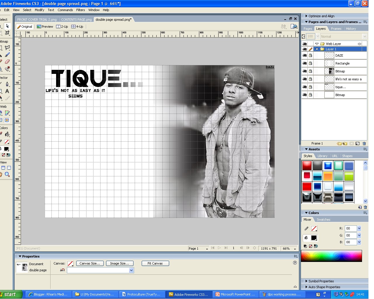
- this is my double page spread so far, as you can see i used the idea of one side of the page being a picture and the other side text. i also incorportated the idea of the big masthead but to make sure i didnt comply the magazine completely i reduced the size if it.
- i like the idea of having a pull quote in the middle of the text as it draws attention to text making the reader more interested.
- in addition to this i like the layout of the second magazine example but i think the layout of the first magazine example will work best with my genre of magazine.

- this is my final and finished double page spread.
Monday, 16 January 2012


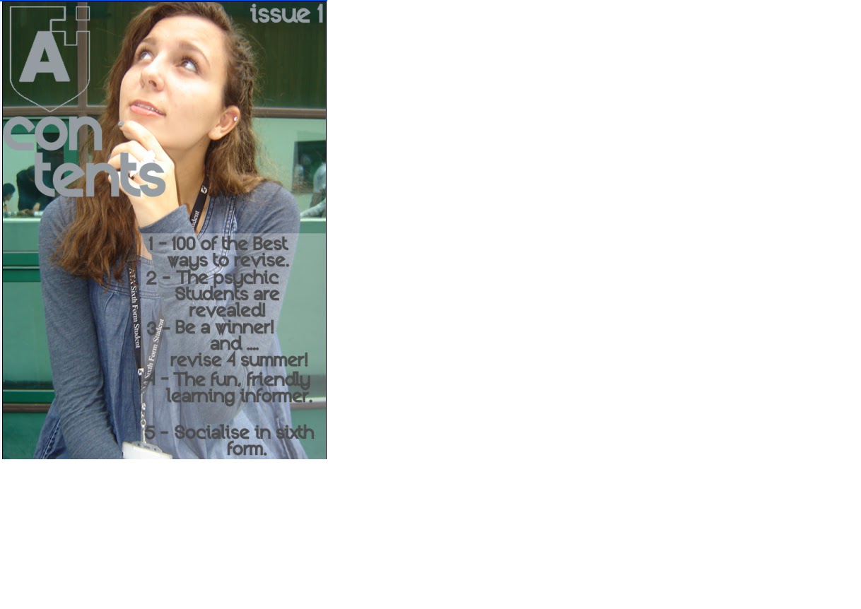
contents page so far...


in the end i decided to change the whole appearacne of the contents page as i found that it was not very strong when it looked like this.
so i made changes and this is now the finished product.

second photoshoot part2


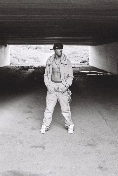

Out of all the pictures i have taken i believe that this set of images, with this male model is the strongest but i particularly think that the third, seventh and eighth pictures out of this set are the strongest, as they draw most attention to the viewer.


Friday, 6 January 2012
second photoshoot


This was my main female model as i felt she worked best behind the camera. i think that the third and fifth images are the strongest and would work best in the contents page as they may not be string enough for the double page spread. The shot type of her that have been taken are mainly headshots. I experiemented with outfits and hair before i took the pictures to make it seem as if the model was in a different place and to give off a realistic look to the magazine.
Subscribe to:
Comments (Atom)