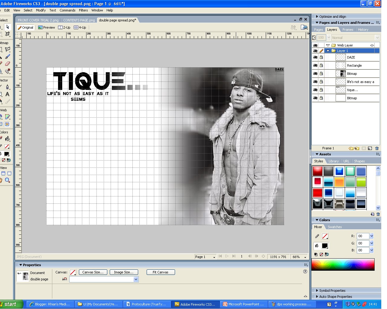
- this is my double page spread so far, as you can see i used the idea of one side of the page being a picture and the other side text. i also incorportated the idea of the big masthead but to make sure i didnt comply the magazine completely i reduced the size if it.
- i like the idea of having a pull quote in the middle of the text as it draws attention to text making the reader more interested.
- in addition to this i like the layout of the second magazine example but i think the layout of the first magazine example will work best with my genre of magazine.

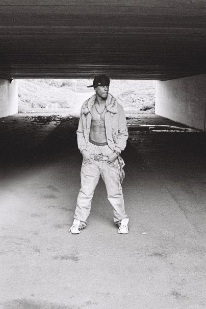
- this is my final and finished double page spread.