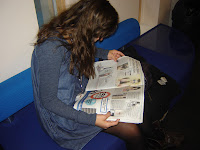
- This photo works well because she looks interested in her newspaper, giving off a focused and intellectual look.
- The lighting is good, as it enables the picture to look clear and precise even though the photo itself was taken inside.
- the shot type used was a medium long shot, and the camera angle is on the same level as my model, capturing majority of my models body as she is silently reading the newspaper.
Image 2 :
- i dont think this phot works very well because its a high angle shot yet she looks vunerable and weak instead of strong and especially because of the shot type and camera angle, my model shouldnt look weak and timid.
- she should be connecting with the camera. The lack of eye contact does not make the photo look any better or stronger.
- on a positive note, the lighting of the photo is good and the background is suttle, nothing spectacular is going on in this shot at all.
- Overall i find thins photo boring.
Image 3:
- The natural light in this photo, gives it a clear, calming and smooth look.
- its a medium long shot again and the camera angel is level to the model.
- her pose captures a deep and in-thought look, she looks as if shes thinking about something specific but at the same time her pose could be portrayed as borderm.
- the fact that shes sitting comfortably on the wall, makes her look relaxed and the crossing of her legs, give off a "cool" element.
- the only critisim i have for this photo is the reflection of people in the school windows, in the background. it unfortunately ruins the photo and gives it a untidy look.
Image 4:
- Once again the natural light compliments this picture.
- the shot type is also a medium long shot and the camera angel is level to the models.
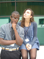
- with one model looking away and the other looking straight at the camera, it doesn't create a connection which fails to make the photo stronger.
- once again the reflections in the background create a untidy look to the photo.
- the background reflection leaves the photo with untidy finish.
- the medium long shot and eye level camera angle create a strong connection towards the camera but once again as only one model has eye contact with the camera, it doent make the photo strong enough.
- the male models pose portrays a smart and knowlegeable look towards the 6th form & learning.
- where as the femasle model looks like she is day dreaming and drifting in and out of her own world.
- on a postive note the natural light compliments this photo in many ways.
Image 6:
- in this shot both model have a pose which portrays deep thinking and interest.
- the male model is connecting with the camera where as the female model is not
- the high camera angel makes them look inferior to the photographer but the medium long shot enhances the photo.
- the reflection in the school building gives the photo an untify look.
- the natural light in this picture makes it look relaxing and clear.
Image 7:
- unfortunately there is another reflection in the background as well as the camera flash, whcih has reflected from the school building.
- the natural light in this photo, makes it look clean and clear, enhancing the "fun" social aspect of 6th form.
- the medium long shot and eye level camera angle works well for this photo.
- both models are communicating with each other and neither are looking at the camera.
- this does not make the phot strong at all but it shows a more social aspect to the 6th form.
Image 8:
- once again the camera flash and people reflection in the photo, give it an untidy look and finish.
- it is also another medium long shot with the same angel on the same level as the models.
- the models are also communicationg with each other and neither are making eye contact with the camera, which makes this shot weak.
- the natural light makes the phot look batter as it shows every fine detail.
- it enhances the social aspect of the 6th form, showing that its a place to hang with friends, as well as learn.
Image 9:
- i am disappointed with this shot because both of these models argeed to let me take a photo of them but then decided at the last minute that they never wanted to.
- its a medium shot and the camera angle is the same level as the models.
- the background doesnt look very attractive either, as the bin, benches and other people are in the background.
- the male model looks uninterested and annoyed, which could show a negative aspect of 6th form as well as ruining the photo.
- the female model is covering her face, this could show a stressful side of 6th form but at the the same time she is not connecting with the camera or communicating with anyone either.
- both models look depressed and un-interested about being photographed, which can be portrayed as a negative side to being a student at the 6th form.
Imsage 10:
- the camera shot is the same level as the model and its a medium close up shot type.
- the models pose looks like she is in deep thought about a particular subject, she also looks as if shes figuring out an answer for a piece of work.
- her facial expression, makes her look as if shes interested in whatever she is thinking about, which gives a good impression of the 6th form.
- an impression that the students are smart and think carefully about what they do, before they do it.
- the only down fall about this photo is the reflections from the school building in the background, as it makes the phot look untidy.
Image 11:
- the two boys in the background, once again give the phot an untidy finish.
- i also think that part of the school building behind the boys, looks unattractive and ruins the picture. i should have told my model to turn around and taken a picture which just has the green glass building in the background but i would have to be sure that there wouldn't be any reflections in the glass.
- the camera shot is a medium long shot and the shot type is eye level to the model.
- her pose is a very cleshay, it's a pose to show how she is stressed from her reserach and work load.
- overall its a good phot but its too obvious and expected, due to the pose she is doing.
Image 12:
- the camea shot is a medium long shot and the shot type is the same level as the camera.
- both models are looking directly into the camera, creating a strong connection with the camera whcih makes the picture looks stronger.
- the background looks unattractive on one side and attractive on the other. i should have made them model more to the right and just captured the green glass building instead of both.
- one model hashis student pass on, which shows he is a 6th form student and they are both smartly dressed, which shows sophistication within the 6th form.
- the are both doing a averagerly standard pose just looking at the camera, they dont look over joyed but they do look fairly content about being a 6th form student.
Image 13:

- the shot type used in this photo is a low angle view, making the models look more superior to the viewer and the camera shot used is a medium long shot.
- both students are dressed smartly and one has his 6th form pass, enhancing the smartness and preciseness of the 6th form.
- both models are looking directly at the camera which along with the shot type used makes both models look even more superior and stronger to the viewer.
- the model on the right is holding his glasses whcih gives hm a smarter and more knowledgable look where as the other model is just looking at the camera.
Image 14:
- the shot type used is a higher angle shot, looking down on both models. this makes them look small and fairly weak but because both models are looking directly at the camera, the eye contact gives the photo more strength.
- the way the students are dressed and posing make them look mature, smart and sophisticated.
- a medium long shot was used, to csapture this photo.
- the background of the photo is not that attractive or interesting which ruins the photo.
Targets: i have decided to set myself some targets when it comes to taking photographs. as i noticed the reoccurring patern of reflections in the background, i need to make sure that when i next take photographs i need to ensure that there is nobody in the background or and reflections from the camera flash, which could potentially ruin the picture.


